← Back to timeline

About the US Presidents Timeline

Every American president since 1897, plotted against the numbers people actually argue about.

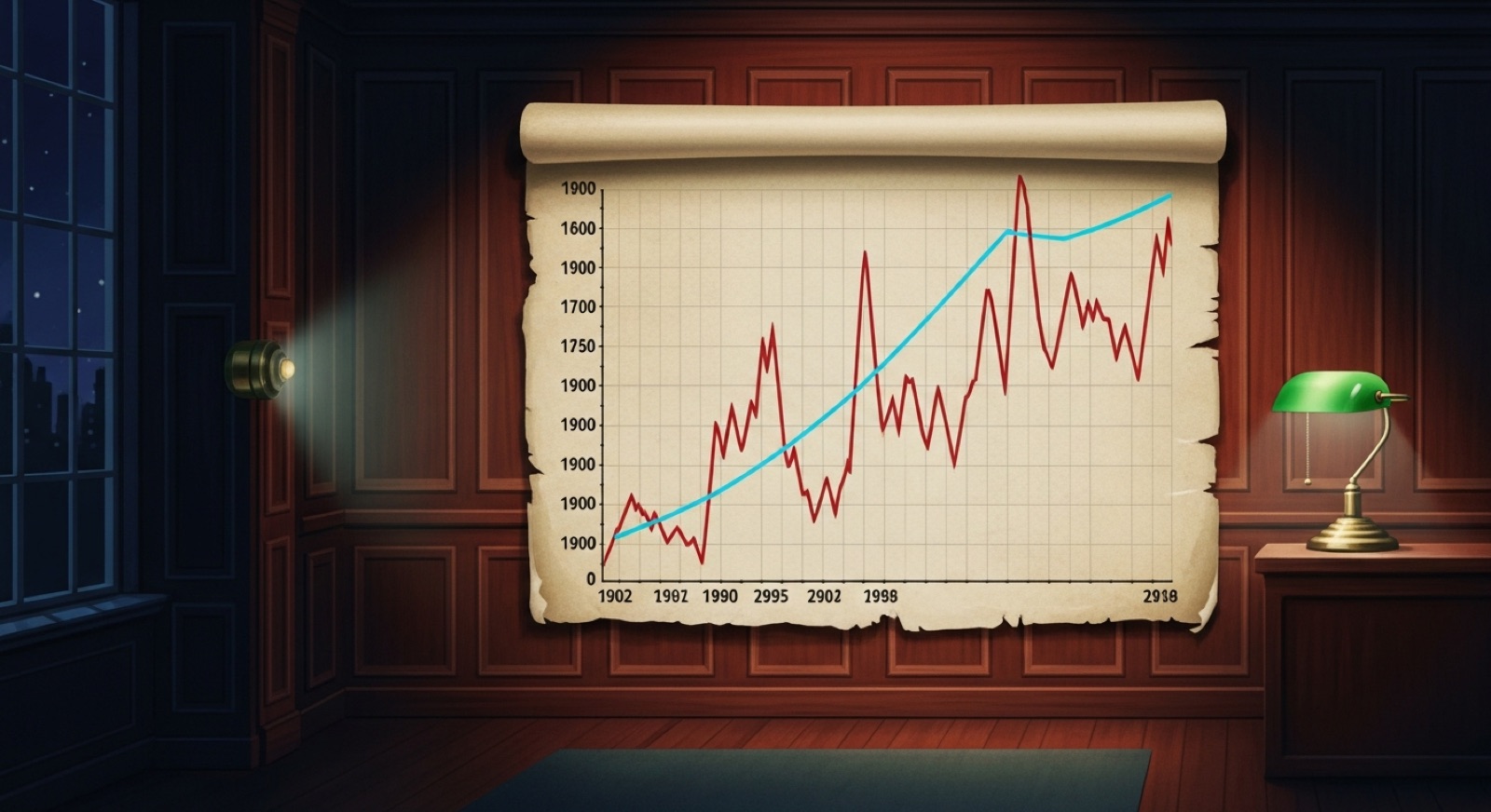
Editorial illustration of a long line chart of American economic data, lit by a single banker's lamp in a darkened wood-paneled study.

Why this site exists

Every election year, the same arguments come back: "the Dow was higher under so-and-so," "gas was a dollar cheaper," "inflation was lower," "more people crossed the border under this guy than that one." Usually the people doing the arguing are looking at one number, one year, one source — and the conversation goes nowhere.

The US Presidents Timeline started as a small Saturday project to put all of those numbers on a single chart, line them up against the actual presidential terms, and let anyone tap through and read the data themselves. No partisan framing, no editorial overlay, no animated talking head. Just the chart, the years, and a one-line bio for context.

It is not a research paper. It is a tool for ending — or at least improving — a particular kind of argument.

What we believe

A short history of the numbers on this chart

The starting year — 1897 — is not arbitrary. It is roughly when continuous, comparable U.S. economic data starts to exist.

Charles Dow first calculated the Dow Jones Industrial Average on May 26, 1896, as an average of twelve industrial stocks at $40.94. The U.S. Bureau of Labor Statistics began collecting family expenditure data in 1917 and published the first national Consumer Price Index in 1921, with retroactive estimates back to 1913. The U.S. Border Patrol was established by Congress on May 28, 1924, as part of the Labor Appropriation Act; recordkeeping on southwest border encounters has been continuous since.

Egg and gasoline price tracking are newer — the BLS retail egg series and the EIA gasoline series both come into useful continuous coverage in the 1970s and 1980s — which is why those lines on the chart begin later than the Dow line.


Painterly illustration of a 1896-era New York Stock Exchange trading floor with ticker machines and an ornate pendulum clock.

How to read the timeline well

A leather notebook open to hand-drawn data charts, lit by a single brass desk lamp.
  • Switch metrics, don't pick one. A president can look great on the Dow and rough on inflation, or vice versa. Toggle through all five.
  • Watch the inheritance. Big moves usually start before the term begins. The 1929 crash hit five months into Hoover; the 2008 crash hit five months before Obama took office.
  • Mind the units. The Dow is nominal — not inflation-adjusted. A doubling between 1980 and 2000 is partly real growth and partly the dollar losing value.
  • Click on the president card. The hobbies and pre-career fields are there partly for context, partly because they make the figures feel like people. Calvin Coolidge had a mechanical horse exerciser. It's good to know.
  • Open the source links. If something on this site looks wrong, the BLS, the EIA, the CBP, and Macrotrends are one click away and almost certainly more recent than we are.

Get in touch

Corrections, data suggestions, or feedback — please email contact@linearmotionjunctionbox.com. If you spot a number that disagrees with the official source we cite, that is the kind of email we most want to receive.

Open the timeline →